

Unlock the Power of Colour with Your Personalised Colour Assistant GPT
Created by Scale With AI’s Expert Brand Strategist, Emma Brooks


Ever feel like your brand isn’t connecting the way it should?
Like you’re throwing stuff at the wall and hoping something sticks? Been there. 🤦♀️
But what if I told you there’s a science 🧬 to this—a way to instantly evoke trust, excitement, or even that warm fuzzy feeling with your audience?
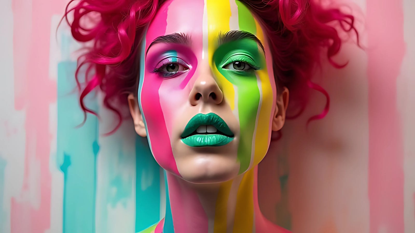
Yep, it’s all about colour. 🌈
And no, I’m not just talking about slapping a random shade of blue on your logo because it “looks nice.” I mean using the psychology of colour to supercharge your brand.
Enter: the SWAI Colour Assistant GPT, your creative partner in mastering the art and science of brand visuals.
So, What’s Colour Assistant GPT?
It’s not just another AI tool—it’s like having a brand strategist whispering colour secrets in your ear. Imagine being able to craft content and visuals that don’t just look pretty but actually work. It helps you:
Nail the exact colours that evoke the emotions you want
Build a brand palette that screams “this is me”
Optimise your visuals for clicks, conversions, and connection
Whether you’re a solopreneur trying to level up, an artist crafting your masterpiece, or a creator using AI-generated imagery, this tool gets you results.
Designed by a Proven Pro: Emma Brooks
Here’s the thing. Anyone can slap some fancy AI features together and call it a day, but Colour Assistant GPT? It’s backed by the expertise of Emma Brooks. With over a decade of experience in colour psychology and branding, Emma has helped businesses:
Build unforgettable brands
Double (even triple) engagement
Create visuals that make you stop scrolling
This GPT? It’s like having Emma’s brain on speed dial.
How Does It Work? (Hint: It’s Stupid Easy)
Share Your Palette: Already have a brand palette? Great. Drop those hex codes in. Don’t have one? No problem. We’ll help you build it from scratch.
Get Instant Insights: In seconds, you’ll learn what each colour communicates—psychologically, emotionally, strategically. (Spoiler: Lime green isn’t just “fun.” It’s a power move.)
Take Action: Use your newfound colour superpowers to create visuals that resonate with your audience on a deeper level.
Why Colour Matters (More Than You Think)
Here’s a wild stat: 90% of first impressions are based on colour. Think about that. Before your audience reads a single word or watches your reel, they’re already deciding whether to stick around based on the vibe your colours give off.
The right palette can:
Boost Engagement: More clicks, more likes, more love.
Increase Sales: Yep, colour drives action.
Build Trust: Because people trust what feels right.
And if your colours are all over the place? It’s like showing up to a wedding in ripped jeans. Awkward.
Real Talk: What Do Your Colours Say About You?
Let’s break it down with the Scale with AI Colour palette:
Primary Colour: #CBF264 (Lime Green)
Meaning: Fresh, vibrant, and forward-thinking.
Psychological Impact: Inspires creativity and optimism. Perfect for brands that want to scream “we’re innovative AF.”
Secondary Colour: #F672A2 (Vibrant Pink)
Meaning: Bold, playful, emotionally engaging.
Psychological Impact: Adds warmth and approachability. Great for modern, outgoing brands.
Neutral Colour: #EDF1E6 (Muted Sage)
Meaning: Calm, sophisticated, balanced.
Psychological Impact: Grounds your palette, bringing elegance and trustworthiness to the table.
See the magic? It’s not just colour—it’s strategy.

Who Is This For?
Honestly, if you’re creating anything that people see, this is for you:
Marketers: Stop guessing what works. Start creating campaigns that pop.
Content Creators: Make your visuals scroll-stopping and share-worthy.
Business Owners: Build a brand people recognise—and remember.
Why Colour Assistant GPT?
Because guessing is expensive. It costs time, money, and let’s be real—your sanity. With this tool, you can skip the guesswork and go straight to what works.
Fast: Insights in seconds.
Effective: Backed by psychology and Emma’s expertise.
Tailored: This isn’t cookie-cutter advice. It’s custom to you.
The way I see it?
Colour is your brand’s secret language.
Master it, and you’re not just seen—you’re felt.
So, why wouldn’t you want that?
How to Access Colour Assistant GPT
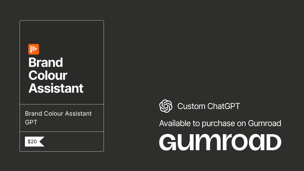
Available for Purchase via Our Gumroad Store
Paid subscribers are entitled to 25% off all custom GPTs and Note Stack products in the Gumroad Store
(Discount code linked below paywall.)
Bonus Insights:
Make Your Brand’s Colours Unforgettable
The Psychology of Colour Combinations
Did you know that the impact of your brand’s colours doesn’t just come from the individual shades and how they work together? Yeah, it’s all about colour harmony. Specific colour combinations can make your brand feel more cohesive and professional, while others can feel chaotic and confusing.
Here are some popular colour schemes to consider:
Analogous Colours (colours next to each other on the colour wheel) create a harmonious and comfortable look. They are great for wellness, beauty, or any brand that wants to feel calm and inviting.
Complementary Colours (opposite on the wheel): These create a high-contrast, vibrant effect. Use sparingly, though, as too much contrast can feel overwhelming.
Monochromatic Colours (variations of the same hue) create a sleek, minimalist look. They are ideal for luxury brands or those wanting a clean, sophisticated vibe.
Pro tip: Look at nature for inspiration. Nature’s colour combinations rarely fail to feel balanced and beautiful.
Cultural Significance of Colours
Here’s a wild card most brands overlook: Colours can mean different things in different cultures. If your brand operates globally (or plans to), you might want to reconsider what your colours represent across various regions.
Red: In Western cultures, red can symbolise passion, danger, or excitement, but in China, it’s a colour of good fortune and prosperity. In South Africa, though, it represents mourning.
White: Associated with purity and peace in the West, but in some Eastern cultures like India, it’s the colour of mourning.
Yellow: Often tied to joy and happiness in the West, but in countries like Egypt, it can be linked to mourning or death.
Pro tip: If your brand spans multiple countries, consider tweaking your colour palette for different markets or being mindful of the cultural interpretations of your colours.
Using Colour for Accessibility
This one is crucial, especially if you want to ensure your brand is inclusive: not everyone perceives colours the same way. Around 8% of men and 0.5% of women have some form of colour blindness. If your brand relies too heavily on colour contrasts that don’t work for these people, you could alienate your audience.
Here’s how to make sure your colours are accessible:
High contrast: Make sure text and background colours are different enough for people with colour vision deficiency to distinguish them easily.
Label colours with text: Instead of relying solely on colour to communicate a message (like red for “urgent”), add a label to explain what the colour indicates.
Use texture or patterns: When differentiating between buttons or options on your website, don’t rely on colour. Add patterns or symbols to make it easy for everyone to engage.
Pro tip: Tools like Stark or Colour Safe can help you test your colour palette for accessibility.
Seasonal Colour Adjustments
This might sound wild, but your brand’s colours don’t have to stay static all year. You can tweak your palette seasonally to match the mood or emotions of specific times of the year.
Spring: Pastels, light greens, and florals. These colours give off vibes of renewal, growth, and positivity.
Summer: Bright, bold colours like yellow, orange, and turquoise. It screams energy, excitement, and fun.
Fall: Earthy tones like burnt orange, maroon, and mustard are perfect for evoking warmth, cosiness, and comfort.
Winter: Cool blues, icy whites, and silvers create a crisp, clean, and sometimes luxurious feel.
Pro tip: You don’t have to rebrand completely each season—just add a few accent colours to your designs or marketing materials to match the seasonal mood.
The Power of Neutrals
Don’t sleep on neutral colours—they’re often the backbone of a well-rounded colour palette. Neutrals like black, white, grey, beige, and even navy help anchor your brand and prevent your bolder colours from overwhelming your audience.
Neutrals work because they’re:
Timeless: Unlike trendier colours that come and go, neutrals always feel appropriate.
Versatile: They can pair well with almost any other colour in your palette, making them super flexible.
Professional: If your brand needs to maintain a sleek corporate image, a neutral base can keep things grounded and serious.
Pro tip: Use neutrals as your background or primary colour, then add splashes of bold colours as accents for attention-grabbing elements.
Quick Checklist: Are Your Colours Working?
Are your colours hitting the mark? Here’s a quick checklist to run through:
Does your colour palette align with your brand’s core message and values?
Have you tested your colours for accessibility?
Do your colours work well in all formats (digital, print, etc.)?
Are you using colour psychology to evoke the right emotions?
Have you considered cultural differences in colour interpretation?
Is there enough contrast to make your designs readable?
Are you open to tweaking your colours seasonally to match consumer moods?
If you answered "no" to any of these, it’s time to re-evaluate and possibly tweak your colour strategy.
With these bonus insights, you cannot only make your brand colours more effective but also gain a deeper understanding of how to truly connect with your audience. Colour is more than just aesthetics—it’s a strategic tool that can make or break a brand’s first impression.
Give the Colour Assistant GPT a go and unlock the full potential of your brand’s visual identity.
Keep scaling!
Dave Meier / Emma Brooks
(Co-Founders of Scale with AI)